Design System: Meet Savile
This is Part 3 of a multi-part blog series that follows the Design System project at Turing School of Software & Design.


This is Part 3 of a multi-part blog series that follows the Design System project at Turing School of Software & Design. Read Part 2 here.
Over the last few weeks, the team was excited to finally start putting all the exciting plans for our design system, nicknamed Savile, into action. There were a few areas of work that had to make progress alongside each other; we couldn't just chunk the work by completing each task start-finish without making headway on a couple of the other pieces. The workflow and communication process our team had already established allowed for this to work out smoothly. We have a daily Stand Up on Slack, a weekly synchronous meeting with the entire team and asynchronous discussions on Basecamp message boards and to-do lists and of course, pull request conversations.
Our Recent Priorities:
- Decide on shared language and naming conventions for the project
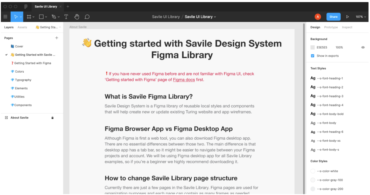
- Create a Figma project that will (eventually) host all the available styles displayed in the documentation site
- Have a live documentation site up, one that is easily maintainable for the developers contributing to Savile
- Get one token and element through the whole design system and into several apps in the Turing suite
What follows is an overview of what we encountered, discussed and learned in pursuit of these goals, and the progress we've made so far:
1. Shared Language
Even during the brainstorming process, we ran into some issues with language. For example, what one person considers an element, another may consider a component. A lot of the terms used in a design system are terms already used in development - HTML element, React component, etc. So there was potential for this to get messy.

So, we spent some quality time defining some key terms to ensure we would use them consistently: Utilities, tokens, elements, components and templates. In addition, we had many conversations weighing the pros and cons of various naming conventions for variables and utility classes, and ultimately made some decisions we all felt good about.
We documented the conversations and rationale for decisions in our Basecamp project and our final language conventions are in the project README and will be on the Savile site as well. Being grounded in our Guiding Principles made us confident that this was the right use of time.
2. Figma
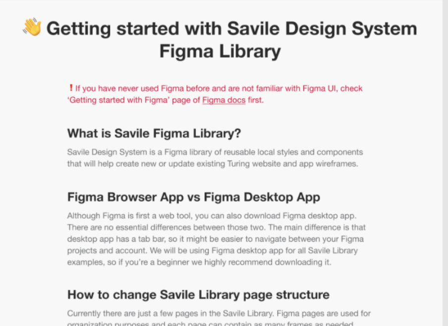
It is important to us to keep a Figma Library updated with the styles that will be available in Savile. We build new apps or features, and sometimes hire designers to build comps for us. We want to make that work as easy, and consistent, as possible for all who are involved in that process.
While it makes the most sense for a developer who adds an element or component to Savile, to also add it to Figma at the same time, no one on our team had much experience with Figma. Seeing as this isn't our only project and we need to maximize our work time, we knew it wouldn't be a good use of time for each teammate to do a deep dive to become Figma experts. So, Edita took on the role of being our Figma expert. She spent a lot of time learning and using it to set up the base project. Then, she distilled the key points of what the rest of the team would need to know into some written documentation and short video tutorials.

This investment of time felt relevant to our Guiding Principles of Accessible, Extensible and Durable.
3. Documentation Site
Savile is a Jekyll project that serves up both 1) the documentation site and 2) the design system itself that the apps in the Turing suite will consume.
- We made a lot of exciting progress on the documentation site side of things, building out some styled pages that display tokens and elements! While building that out, we identified some additional work the documentation generator needed to do for us, so continued to iterate on that.
- We also tweaked some of the scripts that build the design system side in order to accomplish our last goal of "getting one button through".
4. Get one button through
We aimed to "get one button through" - from Savile to hosting to consuming in our apps - so we could identify what issues we may encounter - rather than perfecting the Figma project, CSS code, etc. to only then realize that we have a major blocker.
Luckily, we didn't run into any major blockers or issues, but found some small ones along the way, and learned that we needed to consider a few things we hadn't previously thought of. It was important that we consumed Savile in a variety of apps (Rails, Middleman, Jekyll) because each had small differences that we learned about and documented.
Our Takeaways and Tips
- Identify your road bumps sooner than later. In software, we can always anticipate that some unpredictable challenge will arise. But there is some work we can do to soften the blow by proactively running through all the steps and processes to see how things will, or won't, fit together. It doesn't have to be incredibly time-consuming and maybe isn't necessary for every situation; but it's something to consider.
- Communication. As with most other projects, a Design System has the potential for many moving pieces. From how you use tools like Slack and scheduled meetings to how you name directories and variables, spending the time to norm on best practices and intuitive systems for the team is always worth it in the end.
- When in doubt, look to the Guiding Principles. From big decisions to how each teammate breaks down tasks within one day, looking to those core values the team has already established can be extremely helpful - both from a strategy standpoint as well as keeping the team on the same page and invested in the work.
Wrap Up
We are so excited to have laid this groundwork for Savile and be in the phase where we really bringing it to life. In the coming weeks, we'll share out on our progress and updates!

