Prioritizing Accessibility
Now that a foundation has been laid and we're ready to build components and get this system into apps, we came back to the conversation about accessibility.


This is Part 4 of a multi-part blog series that follows the Design System project, Savile, at Turing School of Software & Design. Read Part 3 here.
One of the motivations for creating a design system for Turing's software suite was to ensure there was a way to continue to enforce accessibility standards. Up until now, we've been focused on getting the system up and running. Now that a foundation has been laid and we're ready to build components and get this system into apps, we came back to the conversation about accessibility!
Our Approach
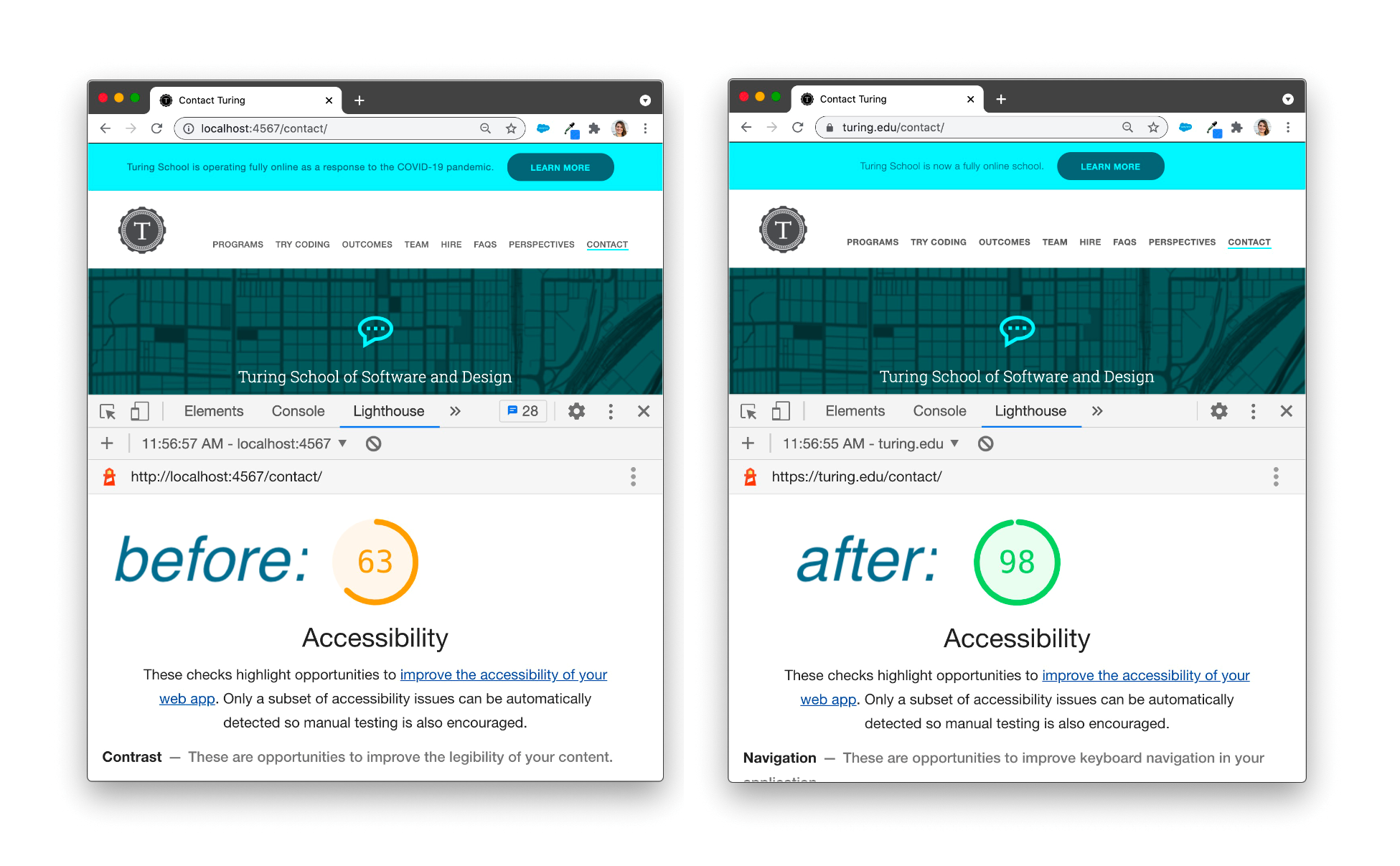
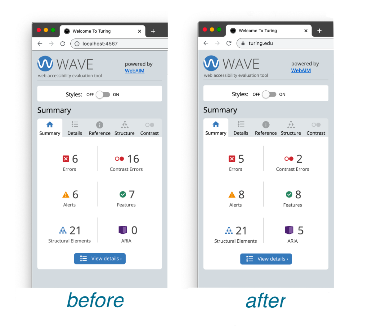
We started by doing an audit of the current state of accessibility for all sites and apps in our suites. We utilized Lighthouse, Koa11y, and WAVE. Many of the violations flagged by each tool were also identified by another, but each shed light on issues the other tools didn't. This isn't the extent of the testing we'll do, but it gave us a good starting point and plenty to work on!
We used our learnings from the accessibility audits to narrow our work for the next month on two goals:
Goal 1: Build out 3 elements - the elements that are currently most problematic from an accessibility standpoint - within the design system and implement them on at least one site
- Our paragraph text that was used on a white background did not have a sufficient contrast ratio. We changed that by using a different a color token for the default paragraph element.
- Our anchor links that sit within text also didn't have a sufficient ratio, so we changed those by using a different a color token for the default anchor element as well.
- We have a lot of buttons and button "look-a-likes" on the site. Some had problematic contrast ratios and some were not using the correct HTML element or ARIA role to communicate their purpose or be used as expected by a screen reader user or power user.
Goal 2: Address accessibility violations that live in the HTML on our marketing site, turing.edu. The design system won't ever help or hurt these areas, but they needed to be taken care of. Some of the things this included were:
- Adding a
langattribute in HTML tag - Providing discernible names for all links
- Making sure images, including logos, have appropriate alt text
- Handling scaling and viewport issues
- Correctly using ARIA roles, specifically for forms
Our Progress
While automated tests can never tell the full story, we know they can help us identify some problems and recognize when they are solved. We have implemented Savile's current latest version in our marketing site and have seen some exciting results:
Tools and Resources for your Accessibility Work
We found the following tools and resources to be helpful in researching, learning, and making decisions, so wanted to share with you. It's worth noting that our work in this area is far from done (never will really be done), and we will likely find many more along the way. The web accessibility community is strong and has created a lot of high quality content. If you've contributed to that - thank you 🎉
- WebAIM creates the WAVE tool for auditing a site, an awesome contrast ratio checker, documentation, tutorials, and more!
- The a11y Project linked us to countless helpful videos, articles, and quick tips
- Many blog posts written by Scott O'Hara
- Following Sara Soueidan, Anna Cook, Nicolas Steenhout, and Lindsay Kopacz and learning from what they share on Twitter and elsewhere!
Wrap Up
While we are happy about the progress we've made so far, we fully acknowledge we aren't done and never really will be, with accessibility. We have more testing to do, improvements to make, and we are committed to checking in on the accessibility of our sites apps regularly to ensure we are maintaining standards.
In our next blog post, we'll be sharing updates on the live sites that use the Savile Design System!