Turing is Building a Design System
This is the first of a multi-part blog series that follows the Design System project at Turing School of Software & Design.

This is the first of a multi-part blog series that follows the Design System project at Turing School of Software & Design.
Our software team is excited to announce that we are starting a new project. In the coming months, we will be building an internal design system for our suite of sites and applications. A design system is a single source of truth for the styles, elements and components used across an organization's digital products.
Why?
Design systems have been a hot trend in tech for a couple of years now, and there's a good reason for it. We listed the benefits and motivations we saw, and broke them down by stakeholders (all of whom will be users of this system, at some level):
- Our Software Team: Putting guidelines in place will help our developers build new features; they will have to spend less time and overhead in making decisions, and they won't have to worry about if their "take on the styles" is consistent with that of other developers. They can look to the design system as a source of truth. Additionally, having one source of truth, in code, will eliminate some serious technical debt will are accruing across many of our codebases.
- Our Instructional Staff: We want our instructors to be able to focus on what they do best: supporting students. This project should easily integrate into the curriculum sites with little initial effort or maintenance from instructors. Additionally, instructors should be able to make requests for components or contribute themselves, if interested, so a system will be put in place for that process.
- Our Students: The journey of a student involves using just about every application or site in our suite. Providing a more consistent experience across our products should allow for smoother transitions through the various stages of the program. Many students get inspired to build small projects for the Turing community and want to use our branding; these student projects could bring in our design system so the products are consistent with our style guide and students will get real-world experience utilizing a design system. Lastly, we believe we should model for our students' good practices; this visible, open-sourced project will model good use of design systems and accessibility principles.
- Our broader community: First and foremost, we want to create a consistent and positive experience for all who might come across our products - we are committed to keeping accessibility at the forefront of our minds as we build and implement this system. We also hope to contribute to the community by open-sourcing the project and documenting our journey in building and maintaining it over time so others can benefit from what we'll surely learn along the way!
The Team
As our team lead, Katelyn Kasperowicz (Software Architect) will oversee the broader project and how it fits into all work our software team does, Amy Holt (Software Developer & Instructor) will lead the day-to-day and contribute, Edita Ignot (Turing+ Fellow) will be an essential contributor and Tanner Welsh (Software Developer) and Sal Espinosa (Back End Program Director) will consult from the user perspective.
The Work Begins
We were well aware that before we had any business building or even planning to build, we needed to do a good amount of research to learn about approaches, best practices, and lessons learned from others. So, we took the last 6 weeks to do research, document learnings and start defining the parameters of the project. Here's what that looked like:
- We read countless blog posts from organizations like GitHub, Flywheel and Betterment on their journey and process through building and implementing a Design System.
- We studied up on best practices from experts like Brad Frost and Tyson Gach, and so many more.
- We spiked on a few ideas using various libraries to wrap our heads around what this might look like. We looked into Diez, Storybook, and TailwindCSS, among others, as well as spiked on a "homegrown" solution.
- We did an assessment of our stack and technical needs. Most of our products are built with a Ruby framework (Rails, Jekyll, Middleman), but not all. We knew that meant our solution would look different from organizations that use front end frameworks.
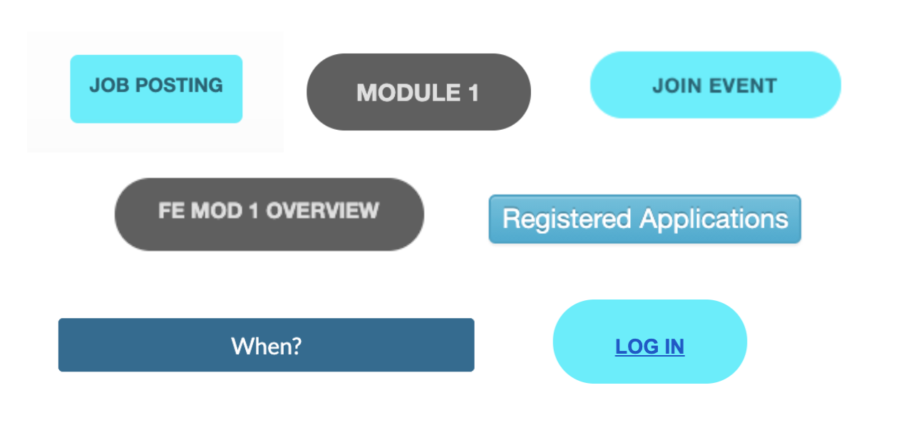
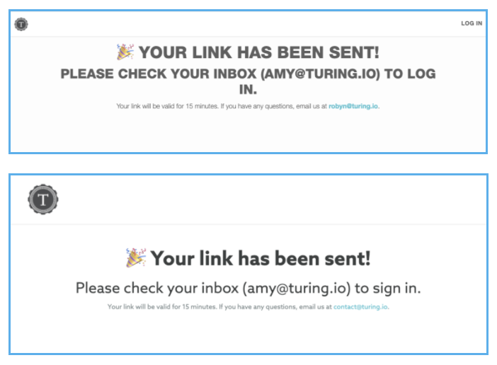
- We did a component inventory to assess what types of components we were working with. Seeing the variance of some components across our products was extremely enlightening and motivating! The example below shows the navbar and message confirmation for two sites - from colors to fonts to spacing, there are many opportunities.

What's Next?
While we learned a ton from our research and felt it was the right use of time, that work was often interweaved into our daily work. We weren't at the place yet where we had quite enough information to be confident in making decisions that were necessary to start building. We decided that we needed some dedicated time, uninterrupted by the daily workflow, to collaborate and seek answers to these hard questions. We planned a 3 day Hackathon during our intermission week so we could do this.
In our next blog post, we'll share how we used our time at the Hackathon and what we learned, planned and built.

